Unlikely Professionals is an engineering firm delivering comprehensive, integrated
code compliance, testing, and reporting services for residential, commercial, and industrial
projects. Operating across 18 states from Maine to Florida—plus South Africa—with
offices in Baltimore, Richmond, New Haven, Providence, Tampa, Cape Town, and Johannesburg.
Over 10,000 projects completed. These guidelines define how we present ourselves.
The Unlikely Professionals logo is a seismic waveform—a direct reference to
the structural monitoring and foundation work we certify. It represents the data trace
of the earth beneath our clients’ homes: measured, recorded, resolved.
Primary — Dark on Light
Reversed — Light on Dark
Monochrome Only
Clear Space & Rules
Clear space: Minimum clearance around the waveform equals the height of the
tallest peak. No text, icons, or other elements may enter this zone.
Permitted colors: Black (#1a1a1a) or white (#fffff8) only. No gold, no color accents on the logo or company name.
Minimum size: The waveform must be at least 120px wide to remain legible.
Do
Use on solid backgrounds only
Maintain original proportions
Pair with the wordmark below, not over
Don’t
Stretch, compress, or rotate
Add drop shadows or glows
Place on busy backgrounds
Use in any unapproved color
Wordmark
Unlikely Professionals
Building Code Compliance Consulting
Unlikely Professionals
Building Code Compliance Consulting
1.2Typography
Three typefaces, each with a clear role. Serif for reading, sans for interface, mono for data.
This separation is non-negotiable—when you see a font, you know whether you’re reading
prose, scanning labels, or looking at machine-generated values.
Primary — Crimson Pro
Anything a human reads in paragraphs. Page titles, body text, quoted material.
Light weight (300) for elegance, regular (400) italic for emphasis.
Light 300 Body · 16px · 1.65
Building code compliance certification for 123 Elm Street, Baltimore. Push pier installation
with 6 piers to bedrock at 22–28 feet.
Regular 400 Italic Quotes · 17px
“Above all else, show the data.”
Light 300 Page Title · 32px
Owner Command Center
Light 300 Section Title · 24px
Pipeline Status Colors
Aa Bb Cc Dd Ee Ff Gg Hh Ii Jj Kk Ll Mm Nn Oo Pp Qq Rr Ss Tt Uu Vv Ww Xx Yy Zz
0123456789 & $£€ () [] {} / \ | – — … “” ‘’
Interface — Source Sans 3
Anything a human scans. Navigation, labels, badges, section headers, button text.
SemiBold (600) for labels, regular (400) for UI text.
SemiBold 600 Section Label · 10.5px
Pipeline Status Colors — 5 Stages
SemiBold 600 Company Mark · 11px
Unlikely Professionals
Regular 400 UI Text · 13px
3 open RFIs · 12 projects scheduled · $45,200 pending
Regular 400 Navigation · 13px
Dashboard · Calendar · Projects · Payments
Data — JetBrains Mono
Anything a machine generated. Record IDs, dollar amounts, dates, hex values, code.
Regular 400 Data Values · 12px
BAL-9001 · $5,200.00 · 2026-03-24 · MANA-INV-9042
Light 300 Record IDs · 10px
66f7a2b1c3d4e5f6a7b8c9d0 · supabase record_id
Medium 500 Hero Stat · 28px
$3.40M
Rule: Crimson Pro for anything a human reads in paragraphs. Source Sans 3 for anything
a human scans (labels, nav, badges). JetBrains Mono for anything a machine generated (IDs, amounts, dates, hex values).
If you’re unsure which to use, ask: “Did a person write this, or did a system?”
Fallback Fonts
Primary
Fallback
System Fallback
Crimson Pro
Georgia
serif
Source Sans 3
system-ui
sans-serif
JetBrains Mono
Menlo, Consolas
monospace
Email — Georgia
Email clients cannot load web fonts. All email signatures and HTML email templates use
Georgia as the sole typeface. Georgia is the serif fallback for Crimson Pro and is available
on every operating system.
Regular 400 Email Body · 14px
Please find attached the Building Code Compliance Certification Package for 123 Elm Street, Baltimore.
Rule: Never embed web fonts (Crimson Pro, Source Sans 3, JetBrains Mono) in email.
Georgia only. This guarantees consistent rendering across Outlook, Gmail, Apple Mail, and every mobile client.
Unlikely Professionals
Unlikely Professionals
1.3Color System
Our palette begins with ink on cream—like letterpress on cotton stock. Accent colors are
earth tones: gold, sienna, teal, muted greens and blues. Never clinical white. Never saturated neon.
Five pipeline stages, each with a dedicated color. Used in indicators, calendar stripes, table badges,
and the visual workflow.
Intake#a0896aWarm tan
Scheduled#6a8aaaSlate blue
Field Complete#7a6a9aPurple
Certification#4a9a7aTeal
Closed#4a4a4aDark ink
Field Complete
Pipeline indicator: 5 dots. Completed stages fill with their color. Current stage pulses with a ring. Future stages are muted.
Branch Identity
Baltimore#b8a038JES Baltimore — BAL
Manassas#5a7a9aJES Manassas — MAN
Richmond#b85450JES Richmond — RIC
North Haven#7a9a7aGroundworks CT — NOR
Branch colors appear as left-border stripes on calendar events and project cards. Status colors fill the background. Two data dimensions encoded simultaneously.
Chart Palette — 12 Earth Tones
#c9a227
#5a7a9a
#7a6a9a
#4a9a7a
#c0392b
#6a8aaa
#8a6a4a
#5a8a6a
#9a7a6a
#4a5a6a
#6a5a7a
#3a6a5a
Geological Strata
Data as material. When rendered as streamgraphs, Sankey diagrams, or network visualizations, data should feel like geological strata—layered, organic, substantial.
1.4Illustrations
Two illustration styles. Both derive from the same visual principles: geometric precision,
earth-tone palette, no decoration. Illustrations must feel like they belong to the data—diagrams,
not artwork.
Abstract — Structural Forms
Geometric compositions from foundation engineering: cross-sections, load paths,
soil strata. Built from rectangles, triangles, and lines. Used as backgrounds,
section dividers, and presentation accents.
Abstract illustrations always use the ink/cream/gold palette.
White elements on dark background (preferred), gold for emphasis.
Architectural — Building Forms
Simplified elevation drawings of residential structures. Line-weight hierarchy:
structure in ink, annotations in gold, measurement lines dashed. These appear
in certification documents and the marketing site.
Architectural illustrations use the light background with ink lines.
Annotations and structural elements in gold. Dimensions in JetBrains Mono.
Do
Use geometric precision—straight lines, consistent stroke weights
Limit palette to ink, cream, gold, and one accent
Embed measurement data directly in the illustration
Match line weight to information hierarchy
Don’t
Use gradients, drop shadows, or 3D perspective
Add decorative elements that don’t encode information
Use saturated colors or photographic textures
Create illustrations that couldn’t appear in a technical document
1.5Data Visualization
Data visualization follows Tufte’s six principles. Every pixel must earn its place.
We don’t simplify by removing data—we simplify by removing everything that isn’t data.
Sparklines
Word-sized inline graphics. Data-ink ratio = 1.0. No axes, no labels—just the data trace.
Baltimore revenue (6 mo)$42.1K
RFI aging trend (30d)+3
Pipeline throughput (Q1)94
Bar Charts
Horizontal bars with embedded labels. No gridlines, no legends. Color encodes category.
Revenue by Branch — Q1 2026
Baltimore
$42.1K
Manassas
$33.5K
Richmond
$18.9K
North Haven
$25.8K
Data-Ink Ratio Targets
Grayscale (print-safe)
1.0
Sparklines
0.85
Pipeline indicators
0.75
Dashboards
0.60
Forms (necessary chrome)
Color-coded (screen)
0.25
Poor — heavy decoration
0.55
Typical — chart tool defaults
0.80
Target — dashboards
1.00
Sparklines — zero non-data ink
Sparkline Vocabulary
Three sparkline forms. Line for continuous trends, bar-chart for discrete intervals with color transition, dot-plot for severity encoding. All word-sized, all inline.
Revenue trend$142K
Cert cycle (days)2.4d avg
RFI aging7 open
No axes. No labels. No legend. The sparkline sits inline like a word. Context comes from the surrounding row. Data-ink ratio = 1.0.
1. Show the Data
If an element doesn’t encode information, it’s chartjunk. Remove it.
2. Multivariate
Encode 4–6 dimensions in one view: position, color, size, shape, border.
3. Small Multiples
Identical charts, different data slices, same scale. Learn the pattern once.
4. Sparklines
Word-sized inline graphics. Data-ink ratio = 1.0. Embedded like a number.
5. Escape Flatland
Show 3+ dimensions on 2D surfaces without 3D charts. Use layering and connection.
6. Data-Ink Ratio
Erase non-data ink. Erase redundant data-ink. Labels live in the data.
7. Density as Beauty
200 projects with pipeline dots is beautiful if every pixel earns its place.
8. Labels in Data
Embed labels directly in the visualization. The eye never needs to leave the data.
Density as Beauty
Tufte’s highest praise is for dense, information-rich displays. A pipeline snapshot of 200 projects
is not clutter—it’s resolution. The eye reads patterns in mass that vanish in summaries.
Every dot, every line, every subtle color shift earns its pixel.
Pipeline Density — 120 projects, 8 statuses, zero summarization
Every project visible. No aggregation, no summaries, no tooltips needed. The pattern is the insight: most work is in field & post-production. Amber dashed rings = on hold. Row 2 (faded) = closed archive. 120 projects in 760 pixels.
Data as Material
Data is not decoration—it is the material itself. We shape it the way an engineer shapes steel:
with warm monochromatic palettes, geological strata, flowing streams, and layered sediment.
The visualization language draws from earth, not software.
Warm Monochromatic Strata
Sedimentary layers. Each band = a time period or project cohort. Reads like geological cross-section.
Status Color Strata
Pipeline strata. Band width = volume at each status. Closed dominates (archive depth). Active stages are thin, sharp slices.
Alluvial / Sankey Flow
Alluvial flow. Bands widen and narrow as projects move through the pipeline. Labels sit inside the stream. Color encodes stage. Width encodes volume. The thin red thread is attrition—cancellations and indefinite holds bleeding off the main current. No legend, no gridlines, no border.
Stream Graph
Stream graph. Layered areas flow symmetrically around a center baseline. Thickness = volume. The shape reveals seasonal patterns—field work expands in spring, cert work peaks in summer. No y-axis. The shape is the data.
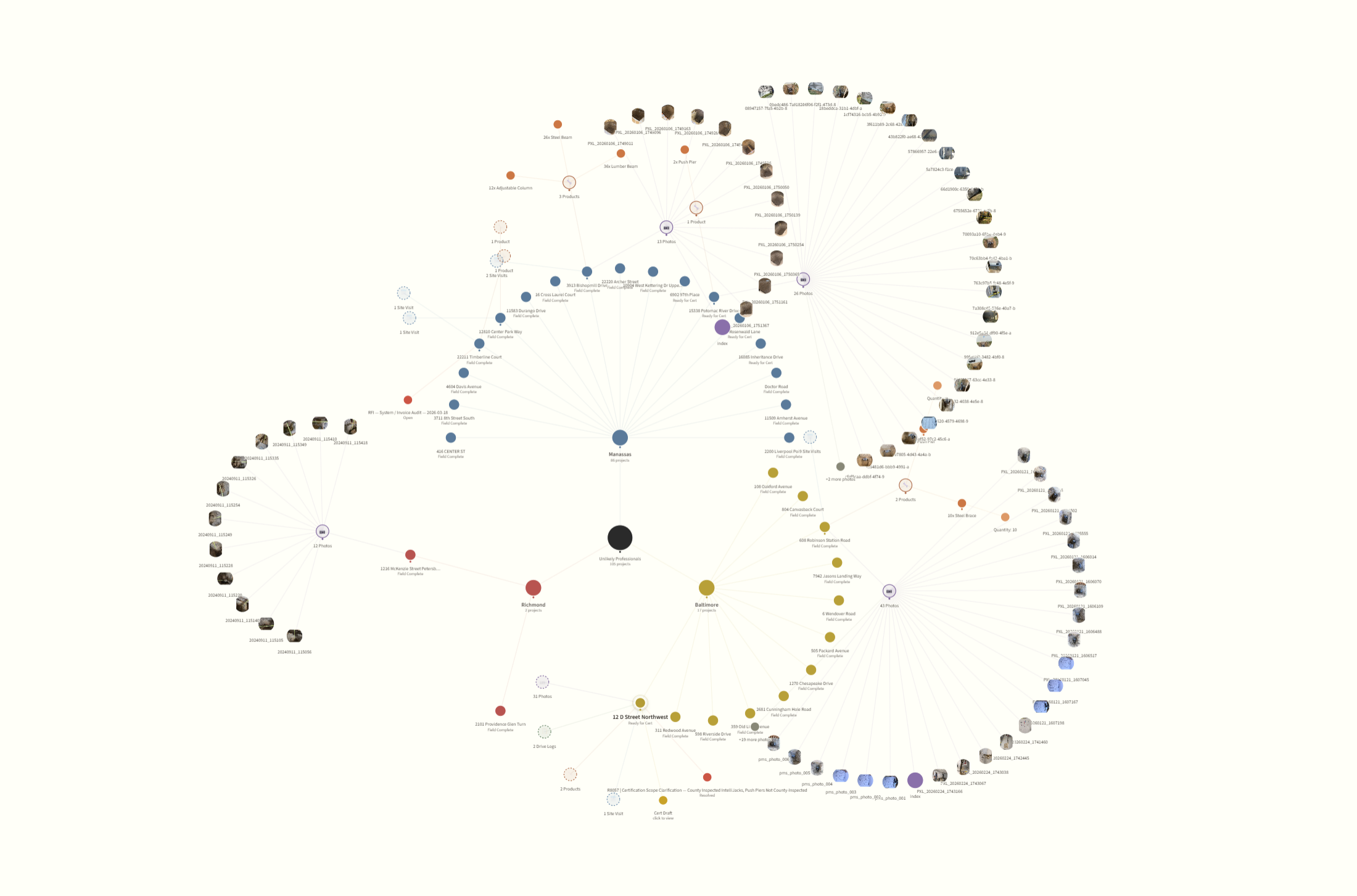
Project Graph
The exploration mode. A force-directed graph where every project is a node connected
to its address, customer, jurisdiction, invoices, files, and people. Click any node to
recenter. Pull a thread, see where it goes.
Node Types
Node
Color
Data
Project
#4a9a7a
Teal — central node
Address
#a0896a
Tan — repeat visits cluster
Customer
#6a8aaa
Blue — links sibling projects
Invoice
#c9a227
Gold — payment chain
Files
#7a6a9a
Purple — archive provenance
Jurisdiction
#8a6a4a
Brown — forms & certifier
Node size = significance. Edge weight = connection strength. Click any node to recenter the graph around it. Drag to explore.
Consumes existing /history/* endpoints—no new backend required.
Diagram
2.1Brand Reel
A short-form video introduction to Unlikely Professionals. The reel should feel like
an engineering document in motion—data traces, structural forms, measured pace.
No corporate stock footage. No upbeat music.
Brand Reel — Coming Soon
Reel Sequence
0:00–0:05 — Waveform logo animates left to right on dark background
0:05–0:15 — Pipeline indicator dots fill sequentially: Intake → Closed
0:30–0:45 — Service areas render on map (MD, VA, CT highlighted)
0:45–0:55 — Numbers: 10,700+ projects, 447 jurisdictions, 11 states licensed
0:55–1:00 — Wordmark + tagline on cream
Audio: ambient field recording (foundation work, measurement equipment).
Subtle, low. No voiceover in the primary cut.
2.2Calendar
The calendar is the scheduler’s primary tool. Branch color as left stripe, pipeline status
as background tint. Two data dimensions on every event with no legend required after the first day.
RFI dot (red, 6px): Appears when a project has an open RFI aging more than 3 business days. The calendar is where the scheduler notices it first.
2.3Presentations
Presentation slides follow the same principles: cream background, Tufte rules, data-dense.
No bullet-point slides. Every slide should be a data display or a single statement.
Title Slide
Unlikely Professionals
Quarterly Review — Q1 2026
Data Slide
Revenue by Branch
$120.3K
Baltimore $42.1K
Manassas $33.5K
North Haven $25.8K
Richmond $18.9K
2.4Collateral
Business cards, letterhead, and certification documents all follow the same hierarchy:
wordmark at top, data in JetBrains Mono, body in Crimson Pro, labels in Source Sans 3.
Business Card — Front
Unlikely Name, Undeniable Expertise.
Structural Engineering
Business Card — Back
Dustin Thacker, Assoc. AIA
Principal · Associate Architect · Systems Engineer
James & Patricia Whitfield
Baltimore County · Permit #BP-2026-04812
BAL-9241
2026-03-24
Pier Log Upload — Field Sheet
One-page handout printed in the JES pier log packet. Crews scan when all piers have been
driven and logged; the QR opens the upload page where they enter the customer + permit
number from the packet header. Soil-strata bands and the bedrock layer are decorative
— they double as a quick reference for typical depth/PSI ranges in our market.
The QR below is a mock; it links to unlikely.pro, not the live upload.
The Building Code Compliance Certification Package is the primary deliverable—the document
that closes permits and gives homeowners confidence. Every design decision in this brand system
converges here: Tufte typography, data-ink discipline, modular composition, and the ink-on-cream palette.
Package Architecture
Each package is assembled from division modules—self-contained blocks
of technical specifications, inspection findings, data visualizations, and compliance criteria.
The SOW determines which modules appear. The wrapper (masthead, project info, professional
certification, signature block) is constant.
Package Structure │ Header + Project Info (constant) │ Scope of Work Summary (generated from SOW lines) ├─UND Module (if underpinning in scope) │ └─ADD-BKFL sub-module ├─ANC Module (if anchors) ├─BRC Module (if bracing) ├─…additional modules as needed… │ Inspection Findings (combined from all modules) │ Code Compliance Matrix (union of all criteria) │ Photo Sheet (division-tagged) │ Driving Log (UND only) └ Certificate of Compliance (PE stamp + signature)
8 Division Modules
Code
Division
Products
UND
Underpinning
Push Pier · Helical · Slab
ANC
Anchors
Wall · Channel
BRC
Bracing
CFRP · Steel · Pin
SUP
Support
Column · Beam · Joist · Sill
FND
Foundation
11 products
WTR
Water Mgmt
Basement · Crawlspace
ENC
Encapsulation
Encapsulation System
RTW
Retaining Walls
Wall · Footing · Backfill · 3 more
44 products across 8 divisions, plus 3 add-on modules (Backfill, Slab Patch, WallSeal).
Every composition is unique. The system assembles the right document for the SOW.
4 Document Types
Every certification package contains up to four documents. Each follows the same Tufte grid:
580px main column + margin notes. Masthead with double rule. Labels in Source Sans 3.
Data in JetBrains Mono. Prose in Crimson Pro.
Per-tube installation data backing the sparkline visualizations. Tube-by-tube depth, PSI readings, interval progression. UND division only.
Photo Sheet
Division-tagged photo grid. Each cell carries a color-coded module tag. General site photos always included. Captions in Source Sans 3.
Certificate
The PE-stamped document. Professional certification statement, signature block, license numbers, jurisdiction seal. The deliverable that closes the permit.
Full Reference Mockup
The complete certification package mockup showing all four document types with live Tufte typography,
data tables, pier sparkline cards, compliance matrix, photo grid, and PE certification block.
Each button below opens a live reference document in an overlay. These are not static mockups—they are the actual templates,
module definitions, and operational charts that drive the certification pipeline.
Cert Package Mockup — all 4 document types with live Tufte typography, sparkline pier cards, compliance matrix, photo grid.
Module Library — 8 divisions, 44 products, 3 add-ons, composition rules.
Operations Charts — division & product matrix, stakeholder map, approval swim lanes, pipeline flow.
Field Production Guide — 9 divisions, photo requirements, measurement specs, 10 Golden Rules, drive log checklists. The inspector’s mobile reference.
3.1Positioning
Unlikely Professionals is an engineering firm that delivers comprehensive, integrated
code compliance, testing, and reporting services for residential, commercial, and industrial
projects. We function as strategic partners to AEC industry leaders, providing seamless
coordination across disciplines and proactive support throughout the project lifecycle.
What We Do
Building code compliance consulting, IBC Chapter 17 special inspections, structural engineering, hydrogeology, and geotechnical services. 18,000+ projects completed across 447 jurisdictions in 25 states.
How We Do It
Technology-driven workflow, jurisdiction-aware certification, fast turnaround. From intake to permit closure, friction is systematically removed.
Territory
25 US states (ME to FL, entire Eastern Seaboard + PA, VT, WV). 7 offices — North America: Baltimore, Richmond, New Haven, Providence, Tampa. South Africa: Cape Town, Johannesburg.
Why It Matters
Contractors need a PE stamp to close permits. Homeowners need assurance the work is sound. Jurisdictions need compliant documentation. We connect all three.
3.2Purpose
Make structural certainty accessible, fast, and invisible.
The best inspection is the one nobody has to think about. When we do our job well,
contractors close permits on time, homeowners sleep soundly, and jurisdictions get
clean documentation without follow-up calls. Our purpose is to make the certification
process disappear into the background of a well-run project.
“Unlikely name, undeniable expertise.”
Tagline
3.3Brand Signature
The waveform is our signature. It appears in three contexts, each reinforcing the same idea:
we measure, we record, we resolve.
The Measurement
The waveform as data—a seismic trace, a load reading, a deflection curve. Precision is the point.
The Resolution
The waveform decays from left to right. Large amplitude becoming small. Problem measured, problem resolved.
The Foundation
The waveform as geology—the earth beneath the structure. We work underground, literally and figuratively.
3.4Narrative
Brand Voice
Quiet confidence. Technical precision without jargon. We don’t oversell.
We state facts and let the work speak.
It started on October 8, 2018, in a basement in Kensington, Maryland—a temporary
house we’d been offered to live in while we put our lives back together after Hurricane
Florence took everything we owned, including our home, just twenty-eight days earlier. One
person, one truck, one scope of work: inspecting foundations for contractors who needed a
licensed professional to sign off on the work. The company was called blackhouse. LLC—a
name that had nothing to do with engineering and everything to do with an obsession. I had
always been fascinated with houses that had been painted black. Entire facades, trim to
foundation, coated in matte black. There was something about the way they commanded a street
without asking permission. And after losing everything, I identified with that. I longed for
that. The black house represented the thing I didn’t have—a home. And it represented
the thing I was: unexpected, different, unusual. The black sheep who needed to re-obtain a
literal house, but who was already at home in who and what he was. Starting a company named
blackhouse. felt like my way of obtaining it. Two years later, I got
my black house.
The work itself was unglamorous. Crawl spaces, mud, measuring bolt torque on helical piles in
August heat. But the work was honest, and the contractors kept calling. One branch became two.
Two became four. The scope expanded—wall anchors, carbon fiber bracing, encapsulation, retaining
walls—and so did the territory: Maryland, Virginia, then Connecticut, then further.
The name Unlikely Professionals wasn’t invented—it was earned. In the field, I was
regularly perceived as someone unlikely to be an architect. The tattoos. The truck. The crawl
space. People made assumptions, and I let the work answer. On January 1, 2026, blackhouse.
became Unlikely Professionals—a name that finally matched what the company had already
become: 25 states, 447 jurisdictions, over 18,000 projects completed, and a growing presence
in South Africa. The name caught up. Everything else had been there for years.
Dustin Thacker, Assoc. AIA
Close ✕
3.5Drivers & Values
Precision
Every measurement, every document, every deadline. Accuracy is not aspirational—it is operational.
Speed
Contractors can’t wait. Homeowners can’t wait. Permits expire. We move at the pace the work demands.
Transparency
Every project has a status. Every status is visible. No black boxes, no “we’ll get back to you.”
Quiet Confidence
We don’t need to convince anyone we’re good at this. The work record does that. 10,700+ projects and counting.
Jurisdiction Fluency
81 jurisdictions across MD, VA, and CT. We know which forms, which codes, which inspectors. Our clients don’t have to.
Partnership
We succeed when our contractors succeed. Their timelines are our timelines. Their problems are our problems.
Data Density
More information, less noise. Our tools show everything and hide nothing. Density is beauty when every pixel earns its place.
Craft
From cert package typography to pipeline indicators, every surface is intentional. Engineering is a craft. So is communicating it.
3.6Collaborative Language
All interface text must be collaborative, not punitive. We work with contractors—
language should reflect partnership, not authority.
Never Say
Say Instead
Kicked Back
Returned for Revision
Rejected
Not Approved
Denied
Not Approved
Deny
Decline
Failed
Needs Attention
Overdue
Aging
Blocked
Waiting on
Why This Matters
Our portal is used by schedulers, branch managers, and accounting staff at our client companies.
They are our partners. Language that implies blame or failure creates friction.
“Returned for Revision” is a workflow step. “Kicked Back” is a judgment.
Standing rule: If a word could make someone defensive, replace it with one that
describes the action without the emotion. This applies to every surface: portal UI, email notifications,
WhatsApp messages, cert documents, and this brand guide.
3.7Visual Language
These choices make the work ours.
Cream, Not White
Every surface starts warm. #fffff8 is the floor. Clinical white creates tension.
Data as Material
Streamgraphs, Sankey diagrams, network graphs. Data should feel like geological strata.
Density as Beauty
Don’t simplify by removing data. Simplify by removing everything that isn’t data.
Flow and Connection
When data has lineage, show it with connections. Lines between nodes, bands between stages.
Labels in the Data
Embed labels directly in the visualization. The eye never needs to leave.
Warm Organic Palette
Gold, amber, sienna, burgundy, warm browns, muted teal. Color should feel like pigment on paper.
Square Edges
Square says “this is a tool.” Rounded corners are decoration. Our surfaces are instruments.
Numbered Sections
01, 02, 03. Orients the reader without parsing headings. Authored information, not generated UI.
Do
Warm cream backgrounds (#fffff8)
Muted earth-tone palette
Labels embedded in the data
Density as beauty—200 pipeline dots is beautiful
Flow and connection between nodes and stages
Square edges on UI elements
Double-rule headers (thick + thin, 4px gap)
Don’t
Clinical white (#ffffff)
Saturated neon or corporate blue
Legends separated from the data
3D charts, pie charts, gradient fills
Drop shadows, bevels, ornamental icons
Rounded corners on everything
Loading skeleton animations
Empty state illustrations
Unlikely Professionals
Building Code Compliance Consulting
25 US States · North America + South Africa · 8,000+ projects